
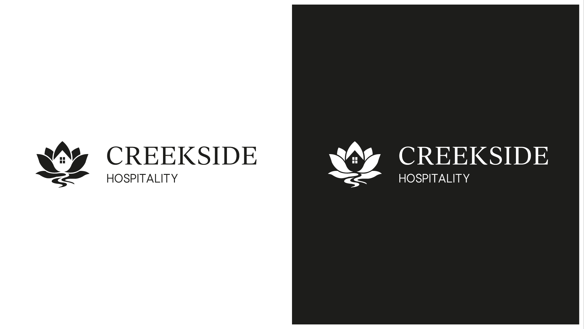
A Hospitality Logo Rooted in
Nature & Warmth
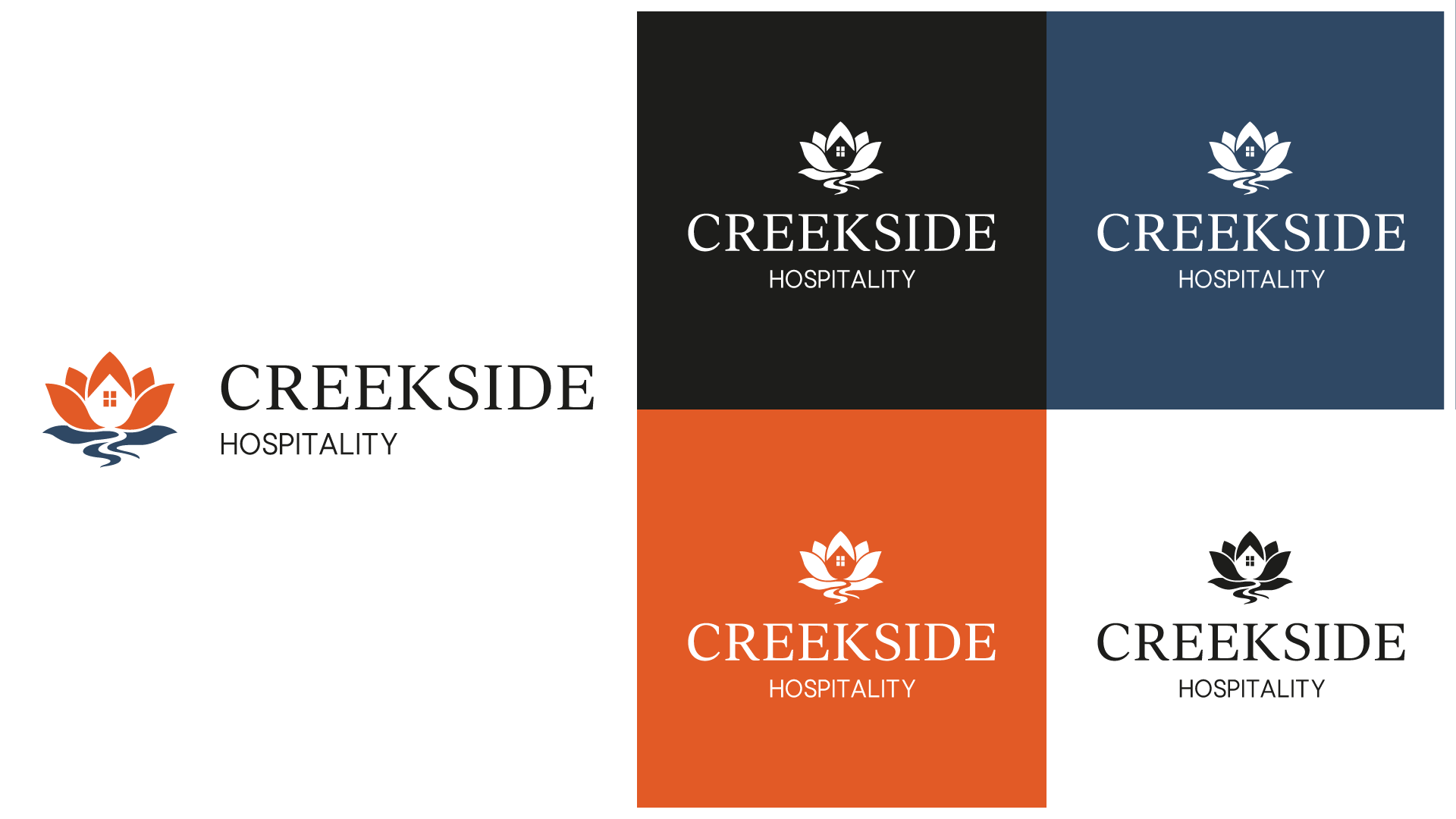
When Creekside Hospitality approached us, we set out to develop a cohesive visual identity that could unify their diverse portfolio of restaurants and hotels. The aim was to create a brand identity that reflects the company’s values, warmth and hospitality, while allowing each venue to retain its own distinct character. Central to the design was establishing a visual language that communicates professionalism and trust, yet feels inviting and dynamic.

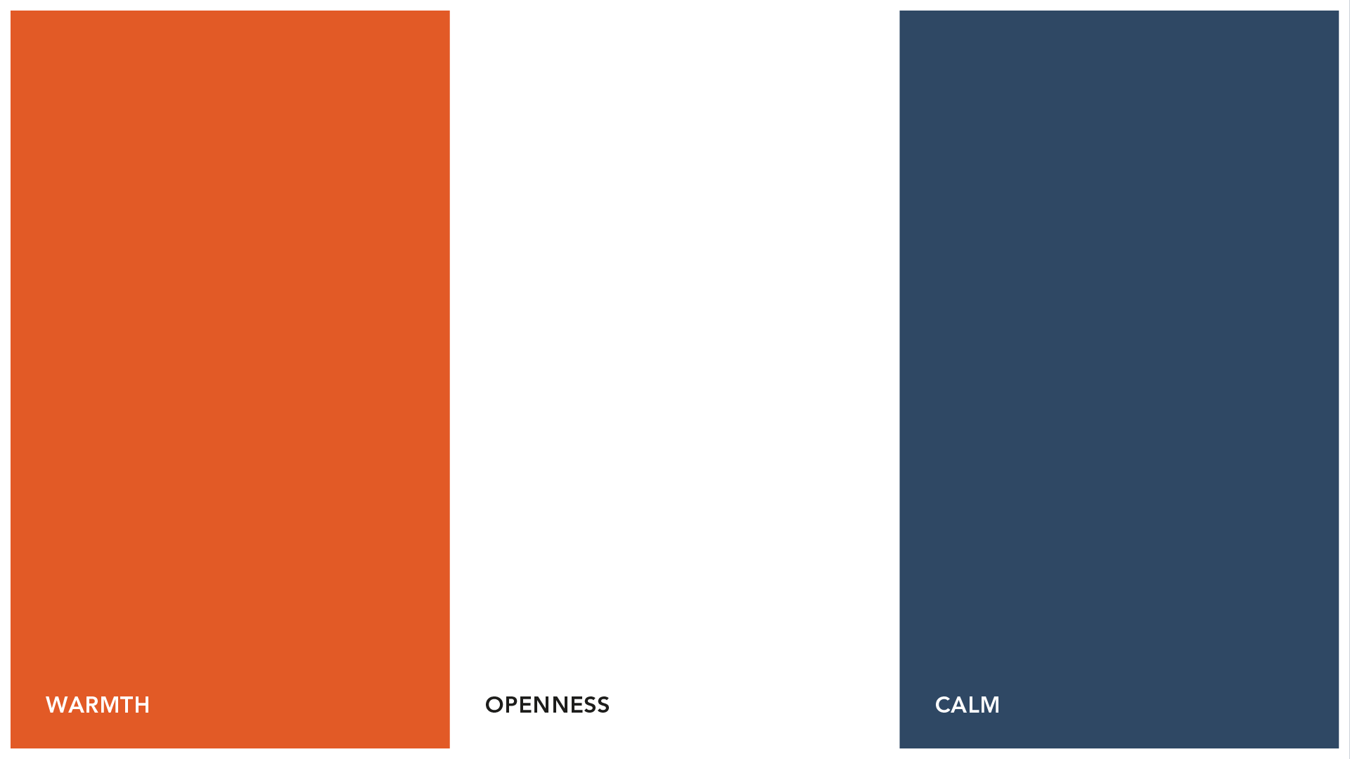
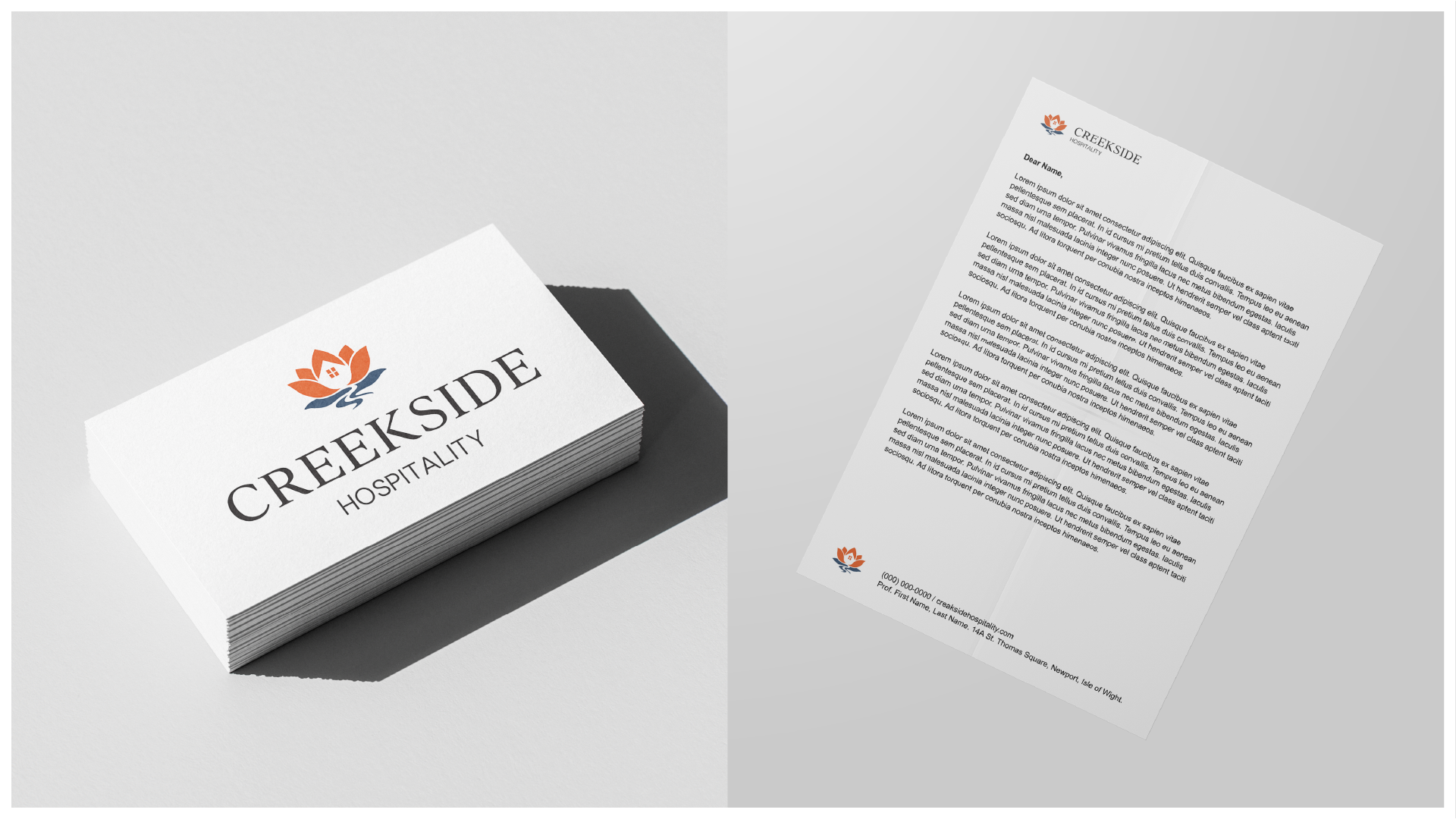
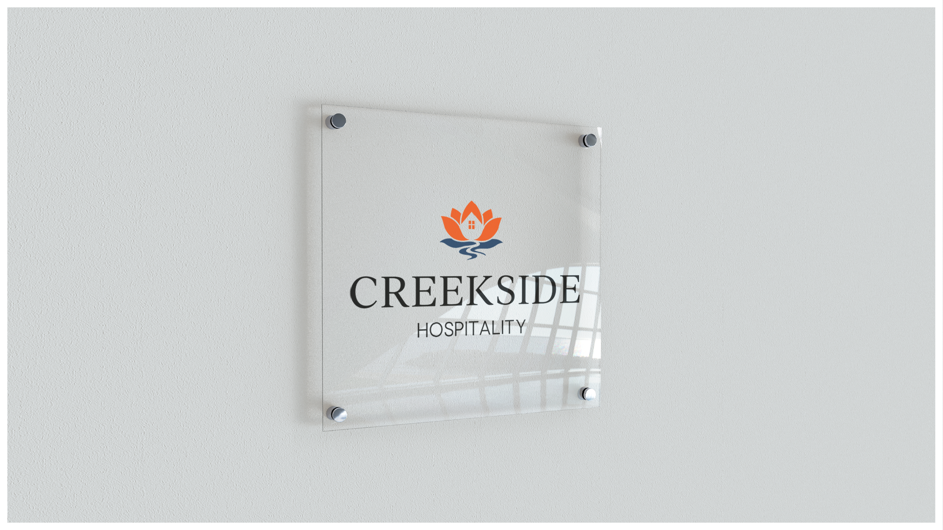
Our goal was to develop a cohesive visual identity that unified Creekside Hospitality’s diverse portfolio while allowing each venue to retain its own distinct character. Inspired by the warmth and welcoming nature of the brand, we used sophisticated yet approachable typography, a warm colour palette, and minimalist layouts to reflect the company’s values and inviting atmosphere. The final design features bold typography, a refined colour palette, and dynamic visual elements that communicate professionalism and trust while maintaining an energetic and approachable feel.

Every Design Starts With A Blank
We Turn Nothing Into Unforgettable